It's hard enough for me to keep up with one blog...two? It ain't gonna happen.
Anyways...the holidays are over and with it most of the stress (albeit there's still some butt-hurt). This last year I did something I really, really dislike - I waited until the very last possible moment to start making the gifts. Granted, they were all edible and we couldn't have done them much sooner, but it still bothered me.
Many years ago I came to the conclusion that it was best to start buying/making Giftmas gifts around August. This way I was able to spend more money/time on each one and when December comes around, I can lay back and relax.
This year (2013), I'll try to start even sooner - as in right now. One of the gifts I want to make is a set of cards+envelopes. I've been looking around Pinterest and blogs to find ideas and a few templates I can use. The idea is to have a good number of cards for different situations (birthdays, holidays, thank you cards...).
I think I want all the cards in the set to have some kind of cohesiveness. It could be a design element, a color or the way the cards fold. I guess the best way to achieve this and still have cards that are appropriate for all occasions would be to keep the card template the same throughout the set.
I also want to use the Pazzles as much as I can, because doing more than one of anything by hand isn't my idea of a good time. So, I have to come up with something that is, at the same time, good-looking without the big store look and not too complicated (that to me will be the hard part).
Saturday, January 5, 2013
Tuesday, July 31, 2012
Figuring Suffusion out - Image Slider
This is an odd post to write on blogger as it's about a theme for another blogging platform, but I needed a place where I could come back and check how things are done.
After I decided to self-host, I had no option but to go with a free theme, as I couldn't (still can't) afford a paid one.
I wanted a magazine template with an image slider, so I searched for those and tried a few ones that looked promising.
In the end I settled with Suffusion as it was the most flexible one I found, but also was one of the easier ones to set up.
That being said, there is a learning curve with Suffusion and to me the biggest problem is remembering what I did way back when, as I don't change the layout that much.
Now, for some reason I chose to feature pages, which lead to other problems (when I was setting the magazine template).
First you are going to decide where the slider will appear, scroll down to Where to Show and choose what works best for you. I chose to only have the slider on the front page, so aside from that option, everything else is disabled.
Under What to Show you have the option of choosing how many things you want showcased. You can choose by page, post, category or tag. I think you can also combine more than one option, but haven't tried this. Like I said, I chose pages to show (which in hindsight was a mistake).
You can also choose how many to show. On that set up page, they say you shouldn't have too many or the slider becomes too slow. I have 7 pages set up and so far haven't noticed any problems.
Under How to Show you're going to select what the theme engine will look for. You might need to play a little bit with the order (drag and drop) until the images show. I use NextGEN with Wordpress, and for me what worked was to have the list in this order:

The other features for the slider - color, text etc., are up to you. Try them out and see which one you like best.
After I decided to self-host, I had no option but to go with a free theme, as I couldn't (still can't) afford a paid one.
I wanted a magazine template with an image slider, so I searched for those and tried a few ones that looked promising.
In the end I settled with Suffusion as it was the most flexible one I found, but also was one of the easier ones to set up.
That being said, there is a learning curve with Suffusion and to me the biggest problem is remembering what I did way back when, as I don't change the layout that much.
Setting up the slider:
Go to appearance, Suffusion options, other graphical elements and choose Featured Content. Once there you can choose how many images (or posts, or pages) you want to display and where you want them to show (as in: front page, every page etc..).Now, for some reason I chose to feature pages, which lead to other problems (when I was setting the magazine template).
First you are going to decide where the slider will appear, scroll down to Where to Show and choose what works best for you. I chose to only have the slider on the front page, so aside from that option, everything else is disabled.
Under What to Show you have the option of choosing how many things you want showcased. You can choose by page, post, category or tag. I think you can also combine more than one option, but haven't tried this. Like I said, I chose pages to show (which in hindsight was a mistake).
You can also choose how many to show. On that set up page, they say you shouldn't have too many or the slider becomes too slow. I have 7 pages set up and so far haven't noticed any problems.
Under How to Show you're going to select what the theme engine will look for. You might need to play a little bit with the order (drag and drop) until the images show. I use NextGEN with Wordpress, and for me what worked was to have the list in this order:

The other features for the slider - color, text etc., are up to you. Try them out and see which one you like best.
Friday, July 13, 2012
Night visitors
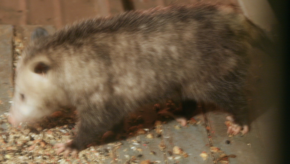

There are at least three different opossums coming over the back porch for snacks at night, this is one of them. Those guys are hard to catch on camera...
Friday, July 6, 2012
Book binding
This isn't the first time I've done notebooks from scratch, but it has been a long time since I did any craft involving paper and since I've learned a few things while doing this, I decided to share.
Last month I came across a bunch of paper bags (the big, brown ones used in grocery stores) and decided to recycle them into a notebook:
 The pages were made from the bags as well as the paper for the covers and spine. I used cardboard from cereal boxes for the (not so hard) covers and lined them with more paper bags.
It's been a long time since I've made one of those, so I checked Pinterest for tutorials on binding. I mixed and matched different techniques to sew the signatures together and then used gauze (yep, the stuff used for wounds) to glue to the spine.
I then cut the card board to size (kinda) and worked on the final look of the cover. For the lining, I crumpled another piece of the bag (where the logo was) a few times, until the paper felt like fabric. I then smoothed it out a bit with my hands and rubbed a stamp pad over it.
It ended up being too dark for my liking, so I painted it over with some crackle paint I had laying around.
Joel likes the fancy kind of cereal (you know the ones with whole grains and whatnot?) and those come in boxes made out of recycled material. Meaning the cardboard is less sturdy than it needs to be to make a decent hard cover. Next time I'll glue two pieces together for each cover.
I need to be more patient. Gluing more stuff before the stuff you glued prior is dry isn't a good idea - as seen here:

This is a photo of the second notebook I've made (because it was fun!). This one has pages done out of what we think is rice paper that isn't good for folding. The lining on the covers is made from crumpled gold tissue paper.

You can see that the covers are warping a bit, that is due to the thickness (or better, the lack thereof) of the cardboard I used.

It's been a long time since I've made one of those, so I checked Pinterest for tutorials on binding. I mixed and matched different techniques to sew the signatures together and then used gauze (yep, the stuff used for wounds) to glue to the spine.
I then cut the card board to size (kinda) and worked on the final look of the cover. For the lining, I crumpled another piece of the bag (where the logo was) a few times, until the paper felt like fabric. I then smoothed it out a bit with my hands and rubbed a stamp pad over it.
It ended up being too dark for my liking, so I painted it over with some crackle paint I had laying around.
What I've learned:
It took me forever to cut the bag into pages and making the holes to sew them together. Next time, I'll make a template for both the pages and to figure out where the holes should go.Joel likes the fancy kind of cereal (you know the ones with whole grains and whatnot?) and those come in boxes made out of recycled material. Meaning the cardboard is less sturdy than it needs to be to make a decent hard cover. Next time I'll glue two pieces together for each cover.
I need to be more patient. Gluing more stuff before the stuff you glued prior is dry isn't a good idea - as seen here:

This is a photo of the second notebook I've made (because it was fun!). This one has pages done out of what we think is rice paper that isn't good for folding. The lining on the covers is made from crumpled gold tissue paper.

You can see that the covers are warping a bit, that is due to the thickness (or better, the lack thereof) of the cardboard I used.
Monday, February 6, 2012
Painting paper - part two
People who follow me on Pinterest might be wondering why I pin so many kids' activities, since I don't have children. The answer is simple, many times kids' activities work well for spicing up the papers that J folds.
He mainly uses elephant hide, which is a kind of paper used in book binding - very durable and pliable, but only come in a few colors, most of them very boring (some, downright ugly).
I'm always on the look out for techniques I can adapt to make the papers more interesting.
Now, with no further ado, let's talk about this other technique I found - marble paper using the suminagashi technique. This one I didn't actually pin when I first saw it, as I didn't have the materials and thought I wouldn't be able to try it without buying the proper kit.
 Since I had a whole weekend to fill up (and didn't really want to do anything else), after trying my hand at the bubble technique, I thought I'd try some of the suminagashi too.
The image on the right is the enhanced version of what I actually got. I posted it here to show that the technique really works, albeit, in my case the colors were very light.
I knew that the technique relies on surface tension, I just didn't know how to make it work - i.e. make the paint particles remain suspended on top of the water until I put the paper on top of it.
I put some water (maybe a finger or so deep) in a cake pan - note to self, next time use a light colored container - and using brushes, placed a few drops of the same concoction I had used for the bubble experiment in the water. It was a no-go. The paint sunk to the bottom (why I expected it to float is beyond me. Soap breaks down surface tension...).
 Because I'm stubborn, impatient and cheap, I decided to try again, this time using a flowing medium I'd bought some time ago, for something I don't remember anymore.
This time, to my surprise it did work. I could see the colors spreading on the surface, so I proceeded to do the "printing".
The image on the left shows the true colors. I think the reason I got such faint colors has to do with the amount of pigment in the paints I used.
I'll get some watercolors in both tubes and pans next time I got to the craft store in town and see if those work better. The idea is that with those I can add as much pigment I need, which would yield better results when doing the marble paper.
I consider this experiment to be successful because I did get the result I was hoping, despite the fact that the colors are washed out.
Monday, January 30, 2012
Painting paper
 I've seen a few painting techniques on Pinterest that I wanted to try. Last weekend I finally had a change to do so, here is what I got.
Bubble painting
I started out with instructions from this blog, but soon found out that I had to tweak the process a little bit. Instead of pressing the paper over the bubbles, like the original instructions, I made enough bubbles and scooped them to the paper using a spoon.
I didn't have any tempera, so I used some acrylics I had. I got very faint colors in the beginning and it might be due to the viscosity of the paints I used. Scooping the bubble onto the paper seemed to solve some of the problem I initially had with intensity of color.
It's a fun technique and a great, inexpensive way to get one of a kind papers from those "what was I thinking" papers we all have around the house.


The bubbles were placed over the paper with the help of a spoon. J and I were working together and the result is that some of the impressions left by the
bubbles have both colors - quite interesting effect.

Friday, May 21, 2010
On my last entry I said I'd re-applied the adhesive to the embossing mat. The difference it made is amazing :D. The cuts are much cleaner now and we've made a few things with no problem what so ever.
In theory, any polygon will work. The only problem is finding out the angles to make the lid collapse properly.
J changed the bottom, so they look like a flower (as seen on the blue one). I think, with a little manipulation, a similar effect can be used on the lid.
The other day, surfing through my blog roll, I found a link to a very interesting box, called impossible box.
The original box is a jpeg file for a square box (the black one with the read trim in the picture). When I first imported the file into the software, I tried to vectorize it. Eventually I gave up on that idea as I was getting a lot of round corners. Since the box is basically straight lines, I used it as a template and did all the lines again.
After I was done with the first one, I began wondering if other shapes would work as well. When J got home, we began talking about it and eventually came up with the pentagonal one.
In theory, any polygon will work. The only problem is finding out the angles to make the lid collapse properly.
J changed the bottom, so they look like a flower (as seen on the blue one). I think, with a little manipulation, a similar effect can be used on the lid.
Subscribe to:
Posts (Atom)